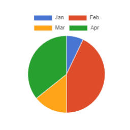
Charts can be embedded with the shortcode chartjs. The general syntax is as follows: [chartjs attribute="attribute value"]CSV content[/chartjs] Several attributes can be added at the same time. Example: [chartjs attribute1="attribute1 value" attribute2="attribute2 value"]CSV content[/chartjs] Here's the list of supported attributes: backgroundColors (string): list of custom background colors (separated by comma) to use for datasets. For example, if there are 3 datasets (d1, d2 and d3) and we want d1 to use the color #0000FF, d2 to use #FFFF00 and d3 to use #008000, the value of the attribute must be #0000FF,#FFFF00,#008000. If some colors are missing (ex.: #0000FF,,#008000), default colors from the theme (set with the attribute theme) are used as fallback (#0000FF,second theme color,#008000); default is no custom colors used barThickness (int): thickness (in pixels) of a bar in bar charts; default is the default Chart.js thickness beginYAxisAt0 (bool): make sure the Y axis begins at 0; default is false borderColors (string): list of custom border colors (separated by comma) to use for datasets. See the description of the attribute backgroundColors for more details; default is the value of the attribute backgroundColors class (string): class or classes to be added to the chart container; default is an empty string fill (bool): fill the area under the line; default is false height (int): chart height (in pixels); default is the default Chart.js height indexAxis (string): axis to use as index; choices are x, y; note that y is automatically used for horizontal bar charts; default is x max (float): maximum value for Y axes; default is no maximum value opacity (float): opacity to apply to the lines or bars; it must be between 0 and 1; default is 0.8 showLine (bool): show (draw) lines; default is true stacked (bool): enable stacking for line/bar charts; default is false tension (float): add Bezier curve tension to lines; when set to 0, lines are straight; default is 0 theme (string): theme used for the chart colors; choices are Chart, Gutenberg, Rainbow, Tertiary, Visualizer, Wordpress; default is Chart time (bool): add support for time line on the X axis; default is false timeUnit (string): time unit to use if time line is enabled; choices are year, quarter, month, week, day, hour, minute, second, millisecond; default is hour type (string): type of chart; choices are bar, horizontalbar, line, pie; default is line yAxes (string): list of Y axes to which the datasets are bound. It allows to enable multi-axis charts. For example, if there are 3 datasets (d1, d2 and d3) and we want d1 to use the first Y axis, and d2 and d3 to use the second Y axis, the attribute value must be y,y1,y1; default is an empty string, so multi-axis feature is disabled and all datasets are automatically bound to the first (and only) Y axis y Here's a fully functional example: [chartjs backgroundColors="#008000" fill="true" opacity="0.35" tension="0.2" theme="Visualizer" time="true" timeUnit="month" yAxes="y,y1"]Year,Sales,Expenses 2020-08,5421.32,1151.21 2021-02,4823.99,887.23 2021-03,4945.32,958.00 2021-10,7086.65,1854.35 2022-05,7385.21,2009.01 [/chartjs] Here's the result: